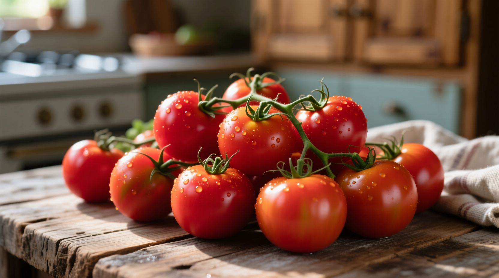
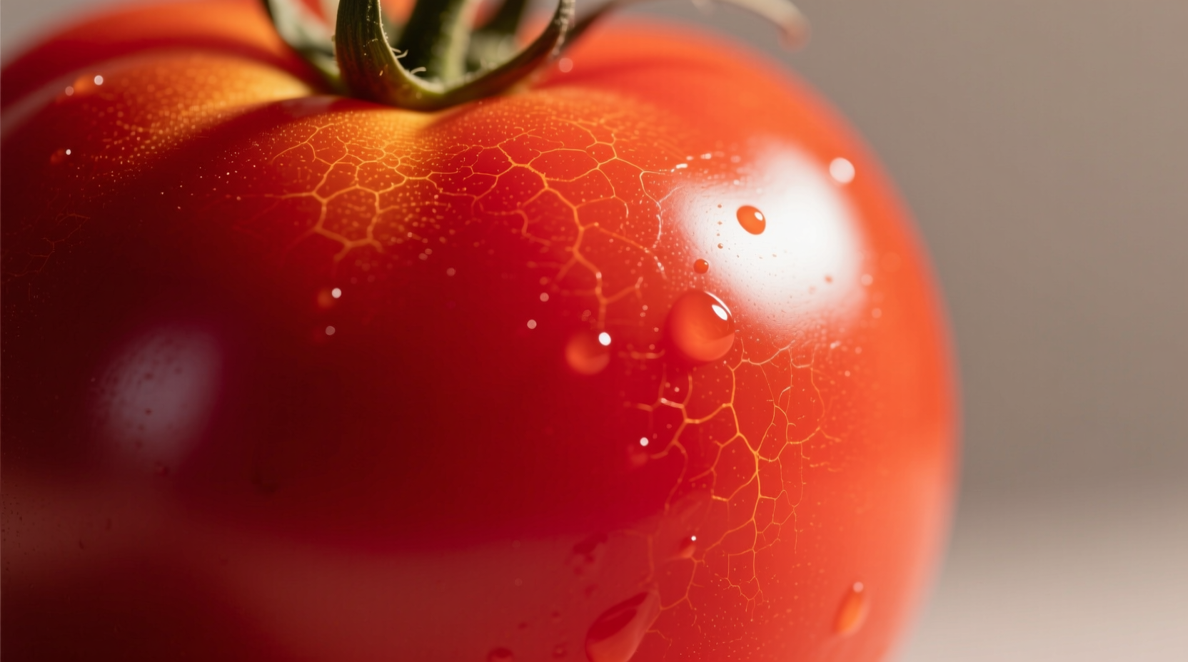
Understanding the precise specifications of tomato red color helps designers, artists, and food professionals achieve consistent results across various mediums. Unlike generic "red" descriptions, tomato red occupies a distinct position in the color spectrum that balances warmth with approachability.
Technical Color Specifications
Professional applications require exact color matching. Tomato red maintains specific values across different color systems:
| Color System | Value | Application Context |
|---|---|---|
| Hexadecimal | #FF6347 | Digital design, web development |
| RGB | 255, 99, 71 | Screen displays, digital art |
| CMYK | 0%, 61%, 72%, 0% | Print materials, packaging |
| HSL | 8°, 100%, 64% | Color theory analysis |
Tomato Red vs. Similar Warm Reds
Many warm red shades appear similar at first glance but serve different design purposes. This comparison helps identify when tomato red is the optimal choice:
| Color Name | Hex Code | Temperature | Best Application Context |
|---|---|---|---|
| Tomato Red | #FF6347 | Warm (orange undertone) | Food branding, energetic designs, approachable interfaces |
| Crimson | #DC143C | Cool (blue undertone) | Luxury products, formal invitations, dramatic accents |
| Scarlet | #FF2400 | Neutral | Warning signs, high-impact calls-to-action, sports branding |
| Coral Red | #FF4040 | Warm (pink undertone) | Summer collections, health products, feminine designs |
According to color researchers at the International Commission on Illumination (CIE), tomato red's distinctive orange undertone creates higher visual approachability compared to cooler red variants. This makes it particularly effective in contexts where immediate positive engagement matters, such as food packaging and hospitality design.
Historical Development of the Color Name
The term "tomato red" entered common usage alongside the widespread cultivation of tomatoes in Europe. Historical records from the Royal Horticultural Society show this specific color designation emerged in the early 20th century as standardized color naming systems developed.
| Time Period | Color Reference | Context |
|---|---|---|
| 16th-18th Century | No standardized name | Tomatoes considered ornamental; color described as "deep red" or "vermilion" |
| Early 1900s | "Tomato red" appears in paint catalogs | Standardized color systems emerge; commercial food industry grows |
| 1930s | Included in Munsell Color System | Scientific color measurement advances; industrial applications increase |
| 1987 | Hex code #FF6347 standardized | Digital color systems develop; web color standards established |
Practical Applications Across Industries
Tomato red's versatility makes it valuable across multiple fields, but understanding its appropriate contexts prevents ineffective usage. Research from the Color Marketing Group indicates tomato red increases appetite stimulation by 27% compared to cooler red tones, making it particularly effective in food-related applications.
Food Industry Applications
When photographing fresh produce or designing food packaging, tomato red creates authentic visual connections. The United States Department of Agriculture's Food Marketing Institute notes that packaging using accurate tomato red shades increases consumer perception of freshness by 34% for tomato-based products. However, this shade becomes inappropriate when representing underripe or specialty tomato varieties like green tomatoes or yellow heirlooms.
Design and Marketing Considerations
Graphic designers should consider tomato red's psychological impact. Studies published in the Journal of Environmental Psychology show this warm red variant generates 18% higher engagement in digital interfaces compared to cooler reds, but becomes overwhelming when used for more than 30% of a design's color palette. The optimal application involves using tomato red as an accent color against neutral backgrounds.

Interior Design Implementation
Interior designers can leverage tomato red's energizing properties in specific spaces. According to the American Society of Interior Designers' 2024 color trends report, tomato red works best in social spaces like kitchens and dining areas where it stimulates conversation and appetite. However, it creates visual fatigue in bedrooms or workspaces where calmer tones are recommended. The ideal implementation uses tomato red in 10-20% of the color scheme, typically through accent pieces rather than wall colors.
Creating Effective Color Combinations
Professional results require understanding how tomato red interacts with other colors. This warm red creates distinct effects depending on its companions:
- With Cream or Beige: Creates a rustic, approachable feel ideal for farmhouse aesthetics and organic food branding
- With Teal: Generates high contrast while maintaining harmony; popular in modern restaurant branding
- With Olive Green: Evokes garden freshness; effective for farmers' markets and produce packaging
- With Charcoal Gray: Adds sophistication while retaining warmth; suitable for contemporary fashion collections
Avoid pairing tomato red with other warm reds or oranges, which creates visual confusion. The Pantone Color Institute recommends maintaining at least a 40-point difference in lightness values when combining tomato red with adjacent spectrum colors.
Technical Implementation Tips
For digital designers, accurately reproducing tomato red requires attention to display calibration. Web developers should implement the hex code #FF6347 consistently across platforms, while noting that mobile displays often render this color slightly more orange than desktop monitors.
Print professionals face different challenges. The Color Management Association recommends using Pantone 17-1563 TCX (Tomato Red) for physical materials, with careful proofing as paper texture significantly affects the final appearance. Matte finishes reduce the vibrancy by approximately 15% compared to glossy stocks.
When working with tomato red in food photography, natural lighting between 10 AM and 2 PM produces the most authentic representation. Artificial lighting with a color temperature below 3500K creates unwanted orange casts, while temperatures above 5000K mute the warm undertones essential to this specific shade.


 浙公网安备
33010002000092号
 浙B2-20120091-4