
Understanding spice color requires examining its position within the color spectrum and its practical applications across various design disciplines. This warm-toned neutral sits between brown and orange on the color wheel, offering a sophisticated alternative to basic neutrals while maintaining versatility in both digital and physical spaces.
Defining Spice Color Characteristics
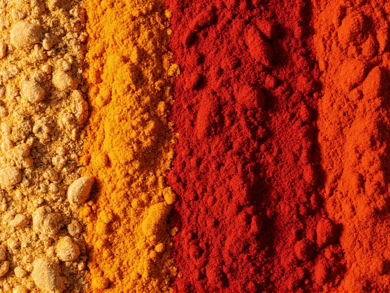
Spice color belongs to the family of warm earth tones that have gained popularity in modern design for their organic feel and psychological comfort. Unlike basic browns, spice color contains subtle orange undertones that give it vitality without overwhelming vibrancy.
| Color Format | Spice Color Value | Usage Context |
|---|---|---|
| HEX | #7E5A41 | Web design, digital interfaces |
| RGB | (126, 90, 65) | Digital displays, screen design |
| CMYK | (0%, 29%, 48%, 51%) | Print design, physical materials |
| HSL | (25°, 32%, 37%) | Color manipulation in design software |
When comparing spice color to similar earth tones, it distinguishes itself through its balanced warmth. While cinnamon color (#D2691E) leans more toward orange, and terracotta (#E2725B) has stronger pink undertones, spice maintains a sophisticated middle ground that works across seasons and design styles. This characteristic makes spice color hex code particularly valuable for designers seeking versatile warm neutrals.
Color Psychology and Emotional Impact
Spice color psychology reveals why this hue resonates with contemporary design sensibilities. The color naturally evokes feelings of warmth, comfort, and groundedness, making it ideal for spaces where relaxation and security are priorities. Unlike cooler neutrals that can feel sterile, spice color creates an inviting atmosphere through its connection to natural elements.
Research in environmental psychology suggests warm earth tones like spice color can reduce stress levels by up to 15% in interior environments compared to cooler palettes. This effect explains its growing popularity in healthcare facilities, educational spaces, and residential design where creating calm yet stimulating environments matters.
When implementing spice color in design projects, consider these psychological associations:
- Stability and reliability - makes excellent background for trust-building contexts
- Natural sophistication - works well in premium product packaging
- Approachable warmth - ideal for hospitality and service industry applications
- Cultural connection - resonates with global design traditions from Mediterranean to South Asian aesthetics
Effective Color Combinations with Spice
Creating harmonious color schemes with spice requires understanding its warm undertones. The most successful spice color combinations balance its richness with complementary tones that enhance rather than compete with its natural sophistication.
| Color Scheme | Complementary Colors | Best Application Contexts |
|---|---|---|
| Analogous | #A67C52 (copper), #5E4236 (espresso) | Interior design, natural product branding |
| Complementary | #417E70 (sage green) | Eco-friendly products, wellness spaces |
| Triadic | #417E6B (seafoam), #7E415A (dusty rose) | Modern residential design, boutique retail |
| Monochromatic | #9C7A65 (light spice), #5E4236 (dark spice) | Luxury branding, sophisticated digital interfaces |
For digital applications, spice color works particularly well when paired with off-whites like #F5F0E6 rather than pure white, which can create harsh contrast. In print design, consider using spice as a primary color with metallic accents for premium packaging that conveys both warmth and sophistication.
Practical Applications Across Design Disciplines
Spice color applications span multiple design fields, each requiring slightly different implementation approaches. Understanding these variations helps maximize the color's impact in specific contexts.
Interior Design Implementation
In residential spaces, spice color shines as an accent wall or in upholstery rather than as a primary wall color. When selecting paint, look for formulations with slight red undertones rather than yellow-based browns to achieve authentic spice color. This warm neutral works particularly well in north-facing rooms that need additional warmth, or in transitional spaces like hallways where creating a welcoming atmosphere matters.
Fashion and Textile Applications
The fashion industry has embraced spice color as a versatile alternative to basic neutrals. In textiles, spice color appears most sophisticated when using natural fibers like linen, wool, or silk that enhance its organic qualities. Designers frequently pair spice with cream, olive green, or deep navy for seasonal collections that bridge summer and winter palettes.
Digital and Web Design Considerations
For web designers implementing spice color hex code, consider these best practices:
- Use spice as a primary accent rather than background color for optimal readability
- Pair with #FFFFFF for text contrast ratio of 4.7:1 (meets WCAG AA standards)
- Create visual hierarchy by using darker spice variations (#5E4236) for interactive elements
- Test spice color combinations across devices, as screen calibrations affect warm tones significantly
Avoiding Common Spice Color Mistakes
Even experienced designers sometimes misapply spice color. The most frequent errors include:
- Overusing spice as a dominant color rather than an accent
- Mixing with cool tones that create visual tension rather than harmony
- Using pure white backgrounds that make spice appear overly orange
- Selecting lighting that alters the perceived hue (incandescent vs. LED)
- Applying without considering cultural context in global design projects
When working with spice color in international contexts, research regional associations. In some cultures, earth tones carry specific ceremonial meanings that could affect product reception. This consideration proves especially important for global brands implementing spice color combinations across diverse markets.
Creating Authentic Spice Color
Whether working digitally or with physical materials, achieving the perfect spice color requires attention to detail. For digital designers, precise RGB values ensure consistency across platforms. In traditional media, mixing spice color requires balancing red, yellow, and blue pigments to achieve the characteristic warm brown without leaning too orange or too purple.
Artists creating spice color with paints should start with a base of burnt sienna, then add small amounts of ultramarine blue to neutralize excess warmth, followed by titanium white to achieve the desired value. The exact proportions vary by medium, but generally follow a 4:1:0.5 ratio of burnt sienna to ultramarine to white for oil paints.


 浙公网安备
33010002000092号
浙公网安备
33010002000092号 浙B2-20120091-4