
Cinnamon slate represents the perfect marriage between two distinct color families: the spicy warmth of cinnamon and the serene coolness of slate. Unlike pure browns or grays, this hybrid shade creates visual interest while maintaining neutrality. Design professionals increasingly favor cinnamon slate for its adaptability across various lighting conditions and its ability to serve as both a calming backdrop and a subtle statement color.
Understanding Cinnamon Slate Color Characteristics
This complex neutral contains subtle reddish-brown undertones from its cinnamon influence while maintaining the muted blue-gray foundation of slate. The resulting color sits comfortably in the warm-cool spectrum, avoiding the starkness of pure gray while preventing the heaviness that sometimes accompanies brown tones. When viewed in natural daylight, cinnamon slate reveals its nuanced complexity, with undertones becoming more apparent in different lighting conditions.
Technical Color Specifications
| Color Format | Value | Application |
|---|---|---|
| HEX | #8C786A | Web design, digital interfaces |
| RGB | 140, 120, 106 | Digital displays, screen design |
| CMYK | 0%, 14%, 24%, 45% | Print design, physical products |
| HSL | 18°, 14%, 48% | Color theory applications |
Color Psychology and Emotional Impact
Cinnamon slate color creates an atmosphere of grounded sophistication. The cinnamon component introduces subtle warmth that promotes comfort and approachability, while the slate element provides stability and calmness. This combination makes cinnamon slate particularly effective in spaces designed for relaxation and contemplation. Unlike cooler grays that can feel sterile, or warmer browns that might feel dated, cinnamon slate strikes a contemporary balance that feels both current and timeless.
Interior designers frequently select cinnamon slate for bedrooms and living areas where creating a restful yet inviting environment is paramount. The color's earthy nature connects occupants with natural elements, supporting biophilic design principles that enhance wellbeing. In commercial settings, cinnamon slate conveys professionalism without coldness, making it suitable for offices, healthcare facilities, and hospitality environments.
Practical Applications Across Design Disciplines
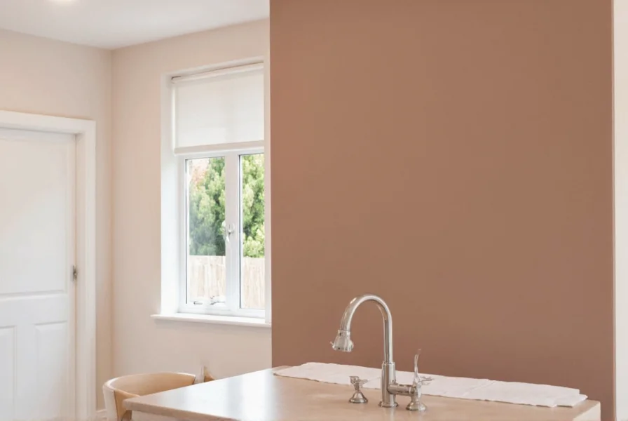
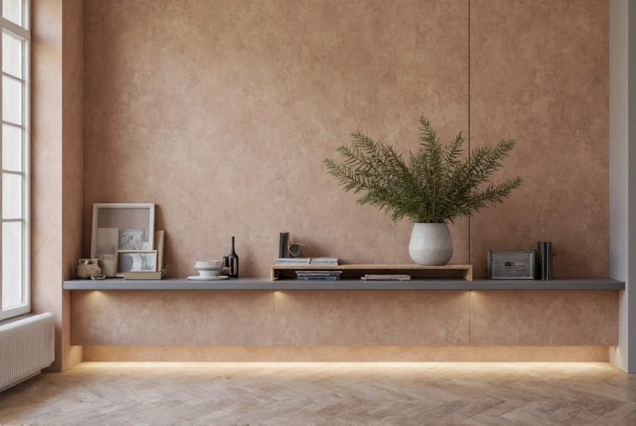
Interior Design: Cinnamon slate works exceptionally well as a wall color in living rooms, bedrooms, and dining areas. It complements both modern and traditional furnishings, serving as an excellent backdrop for artwork and decorative elements. When selecting cinnamon slate paint color for walls, consider lighting conditions—north-facing rooms benefit from its warmth, while south-facing rooms showcase its subtle complexity.
Fashion and Textiles: In clothing and accessories, cinnamon slate offers a sophisticated alternative to basic neutrals. It appears frequently in autumn and winter collections as a versatile base color that coordinates with both warm and cool accent shades. Designers appreciate how cinnamon slate fabric maintains visual interest without competing with patterns or textures.
Digital Design: For websites and applications, cinnamon slate serves as an excellent background or accent color that reduces eye strain while maintaining visual hierarchy. Its balanced nature makes it suitable for both light and dark mode interfaces when adjusted appropriately.
Effective Color Pairing Strategies
Cinnamon slate's versatility shines when paired thoughtfully with complementary colors. Consider these proven combinations:
- Natural Pairings: Combine with olive green, terracotta, and warm beiges for an earthy, organic palette that feels grounded and harmonious
- Contrast Approach: Pair with deep teal or navy for sophisticated contrast that maintains warmth
- Monochromatic Scheme: Layer different tones of cinnamon slate for subtle dimension without visual clutter
- Modern Minimalism: Contrast with crisp white and natural wood tones for clean, contemporary spaces
When working with cinnamon slate color combinations, remember that metallic accents in brass or copper enhance its warmth, while silver or chrome accents highlight its cooler slate elements. The choice depends on whether you want to emphasize the cinnamon or slate aspect of the color.
Cinnamon Slate vs. Similar Color Options
Many confuse cinnamon slate with related shades, but key distinctions exist:
- Cinnamon Slate vs. Greige: While greige blends gray and beige, cinnamon slate incorporates more pronounced reddish undertones from cinnamon, creating a richer, more complex neutral
- Cinnamon Slate vs. Classic Slate: Traditional slate leans cooler with blue or green undertones, while cinnamon slate introduces noticeable warmth
- Cinnamon Slate vs. Taupe: Taupe typically has more purple undertones, whereas cinnamon slate maintains a reddish-brown warmth
Understanding these subtle differences proves crucial when selecting paint colors or design elements. A common mistake involves choosing what appears to be cinnamon slate in a small swatch, only to discover it reads as either too warm or too cool when applied to larger surfaces.
Implementation Tips for Best Results
When incorporating cinnamon slate into your projects, consider these practical recommendations:
- Test samples on multiple walls to observe how lighting affects the color throughout the day
- Consider the existing elements in your space—cinnamon slate complements warm wood tones better than cool woods
- For smaller spaces, use cinnamon slate on accent walls rather than all surfaces to prevent visual heaviness
- In digital design, pair with slightly lighter or darker variants for effective visual hierarchy
- When selecting cinnamon slate paint color, request samples with both matte and eggshell finishes as sheen affects perceived warmth
Professional designers often recommend viewing cinnamon slate alongside your existing furnishings and textiles before finalizing decisions. The color's complex nature means it can shift appearance based on surrounding elements—a fact sometimes overlooked when selecting from small swatches alone.
Conclusion
Cinnamon slate color represents a sophisticated evolution in neutral color palettes, offering the best qualities of both warm and cool tones. Its balanced nature makes it remarkably versatile across design disciplines, from interior spaces that require both comfort and sophistication to digital interfaces needing visual calm. By understanding its technical specifications, psychological impact, and effective pairing strategies, designers and homeowners can leverage this nuanced color to create spaces that feel simultaneously contemporary and timeless. As color trends continue evolving toward more complex neutrals, cinnamon slate remains a reliable choice that bridges traditional and modern aesthetics.
Frequently Asked Questions
Is cinnamon slate considered a warm or cool color?
Cinnamon slate occupies a balanced position between warm and cool. It contains warm cinnamon undertones (reddish-brown) blended with cool slate elements (blue-gray), creating a neutral that works in both warm and cool color schemes. The perceived temperature often depends on lighting conditions and surrounding colors—natural light reveals more warmth, while artificial lighting may emphasize the cooler slate aspects.
What colors go well with cinnamon slate?
Cinnamon slate pairs beautifully with olive green, deep teal, warm beiges, and creamy whites. For contrast, it works well with navy blue or burgundy. Metallic accents in brass or copper enhance its warmth, while silver highlights its cooler elements. When creating cinnamon slate color combinations, consider using it as your base neutral with 1-2 accent colors to maintain visual harmony without overwhelming the space.
How does cinnamon slate differ from greige?
While both are complex neutrals, cinnamon slate contains more pronounced reddish-brown undertones from its cinnamon influence, whereas greige blends gray and beige with typically more yellow or tan undertones. Cinnamon slate generally reads as richer and deeper than most greige shades, with a more distinct earthy quality. The slate component gives it a slightly cooler foundation than traditional greige, making it more versatile in spaces with both warm and cool elements.
Is cinnamon slate suitable for small rooms?
Yes, but with strategic application. In small rooms, use cinnamon slate on a single accent wall rather than all surfaces to prevent the space from feeling closed in. Pair it with lighter complementary colors on other walls and incorporate ample lighting to maintain openness. The color's earthy nature can actually make small spaces feel more intimate and welcoming when balanced with lighter elements and reflective surfaces.
What's the best lighting for showcasing cinnamon slate color?
Natural daylight best reveals cinnamon slate's complexity, showing both its warm and cool elements throughout the day. For artificial lighting, warm white bulbs (2700K-3000K) enhance its cinnamon aspects, while daylight bulbs (4000K-5000K) highlight the slate components. A layered lighting approach with both ambient and task lighting allows the color to display its full range of undertones in different conditions, creating dynamic visual interest as lighting changes.


 浙公网安备
33010002000092号
浙公网安备
33010002000092号 浙B2-20120091-4