

Cinnamon color represents the perfect balance between vibrant warmth and earthy sophistication. This distinctive reddish-brown shade takes its name from the inner bark of the cinnamon tree, which reveals this warm, inviting tone when dried and processed. Unlike pure browns that can feel flat or neutrals that lack personality, cinnamon brings energy while maintaining approachability—a quality that explains its growing popularity across multiple design disciplines.
The Science Behind Cinnamon Color
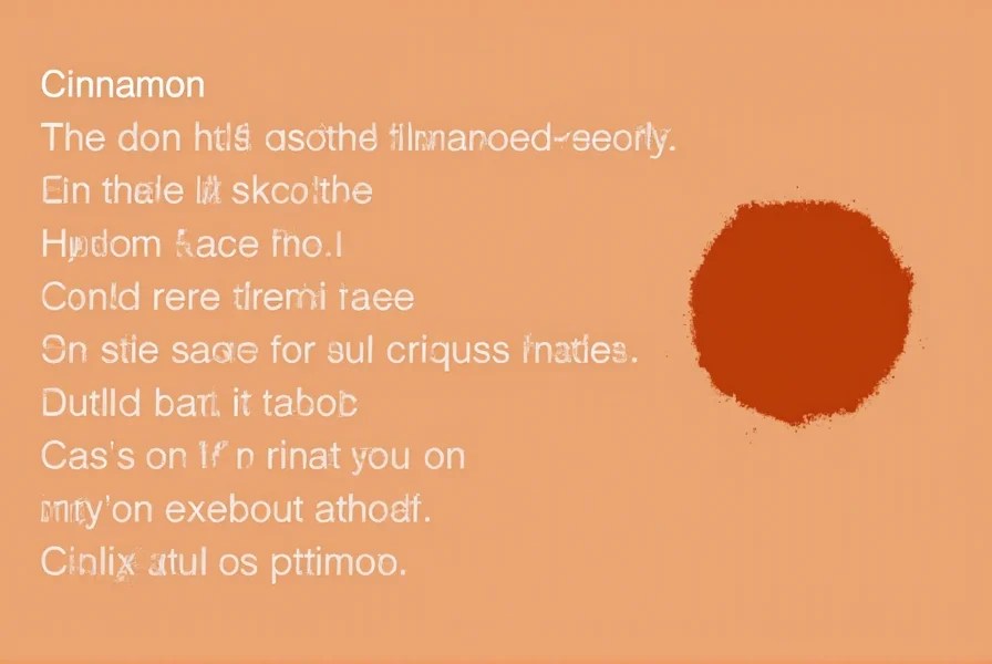
Cinnamon occupies a specific position on the color spectrum that gives it unique properties. With a hex code of #D2691E and RGB values of 210 red, 105 green, and 30 blue, this color contains significantly more red than green, with minimal blue component. This composition places it firmly in the warm color family, specifically within the orange-brown transition zone.
Color scientists categorize cinnamon as a tertiary color, created by blending primary and secondary hues. Its specific wavelength falls around 600 nanometers, which the human eye perceives as this distinctive warm reddish-brown. This wavelength interacts with light in ways that create depth and dimension—qualities that make cinnamon appear richer in natural lighting conditions.
| Color System | Cinnamon Values |
|---|---|
| Hex Code | #D2691E |
| RGB | 210, 105, 30 |
| CMYK | 0%, 50%, 86%, 18% |
| HSL | 26°, 75%, 47% |
Cinnamon Color Psychology and Emotional Impact
The psychological effects of cinnamon color stem from its position in the warm color spectrum. Research in color psychology indicates that warm tones like cinnamon stimulate feelings of comfort, security, and groundedness. Unlike brighter oranges that energize, cinnamon's brown component tempers the intensity, creating a more soothing yet still uplifting effect.
Interior designers frequently leverage cinnamon color psychology to create spaces that feel simultaneously inviting and sophisticated. The color's earthy quality connects to natural elements, promoting feelings of stability, while its warmth encourages social interaction—making it particularly effective in communal spaces like living rooms and dining areas.
Practical Applications Across Design Disciplines
Interior Design with Cinnamon
When incorporating cinnamon color in interior design, consider its versatility across different applications. As an accent wall color, cinnamon creates a dramatic yet welcoming focal point. In smaller doses—through textiles, furniture, or accessories—it adds warmth without overwhelming a space. The key to successful cinnamon interior design lies in balancing its intensity with complementary neutrals.
For modern spaces, pair cinnamon with cool grays and crisp whites to create contrast. In traditional settings, combine it with other warm earth tones like ochre and olive green. The cinnamon color palette works exceptionally well in spaces that receive ample natural light, as sunlight enhances its reddish undertones.

Fashion and Textile Applications
In fashion, cinnamon serves as a sophisticated alternative to basic neutrals. The color complements a wide range of skin tones, particularly those with warm undertones. Designers increasingly feature cinnamon in autumn and winter collections, where its warmth provides visual comfort during cooler months.
When building a cinnamon color wardrobe, consider these pairing principles: with cream or beige for a subtle earthy look, with navy for sophisticated contrast, or with olive green for a nature-inspired ensemble. The cinnamon color combinations that work best maintain balance—allowing the richness of cinnamon to shine without creating visual competition.
Digital and Graphic Design Considerations
For digital interfaces, cinnamon offers a distinctive alternative to standard corporate blues and reds. When implementing cinnamon color hex code in web design, use it strategically for call-to-action buttons where its warmth can encourage engagement without the urgency of pure red.
Accessibility considerations are crucial when using cinnamon in digital spaces. Ensure sufficient contrast against background colors—particularly when used for text. The cinnamon color palette works best as an accent rather than a primary background color in digital contexts to maintain readability while adding visual interest.
Cinnamon Color Combinations That Work
Creating effective cinnamon color combinations requires understanding color relationships. The most harmonious pairings include:
- Cinnamon and Cream: Creates a soft, inviting contrast that highlights cinnamon's warmth
- Cinnamon and Teal: Provides striking complementary contrast with sophisticated appeal
- Cinnamon and Olive Green: Evokes natural, earthy harmony perfect for organic brands
- Cinnamon and Deep Plum: Creates rich, luxurious pairings ideal for evening wear or premium products
- Cinnamon and Charcoal Gray: Modern contrast that maintains warmth while adding sophistication
When developing a cinnamon color palette, consider the 60-30-10 rule: use your primary color (cinnamon) for 60% of the space, a secondary color for 30%, and an accent color for the remaining 10%. This creates visual hierarchy while ensuring cinnamon remains the focal point without overwhelming the design.
Cinnamon vs. Similar Warm Tones
Understanding the subtle differences between cinnamon and similar warm tones helps in precise color selection. While often confused with related shades, cinnamon has distinctive characteristics:
- Cinnamon vs. Burnt Orange: Cinnamon contains more brown, making it deeper and less vibrant than burnt orange, which leans more toward pure orange with less brown influence
- Cinnamon vs. Rust: Rust has stronger red undertones and appears more oxidized, while cinnamon maintains a cleaner, spicier quality
- Cinnamon vs. Terracotta: Terracotta is lighter and contains more pink undertones, giving it a distinctly earthy pottery quality compared to cinnamon's spice-inspired warmth
- Cinnamon vs. Copper: Copper has metallic sheen and more yellow undertones, while cinnamon remains a matte, organic reddish-brown
Cultural Significance of Cinnamon Color
Cinnamon color carries different meanings across cultures, often connected to its namesake spice. In many Eastern traditions, cinnamon represents prosperity and protection. Ancient Egyptians used cinnamon in embalming rituals, associating it with preservation and the afterlife. In Chinese culture, cinnamon symbolizes warmth, protection, and good fortune.
Modern branding frequently leverages cinnamon color psychology to convey natural, organic qualities. Food brands use it to suggest warmth and spice, while wellness companies employ it to communicate earthiness and authenticity. Understanding these cultural associations helps designers make intentional choices when implementing cinnamon in global contexts.
Implementing Cinnamon Color Effectively
Successfully incorporating cinnamon requires attention to context and execution. In interior spaces, test samples at different times of day, as cinnamon's appearance shifts dramatically with changing light. In fashion, consider how fabric texture affects the color—matte fabrics showcase cinnamon's depth better than shiny materials that might emphasize orange undertones.
For digital applications, always check how cinnamon appears across different devices and screens. The cinnamon color hex code may render differently on various displays, so conduct thorough testing to ensure consistency. When creating print materials, specify exact CMYK values to maintain color accuracy across production runs.
Frequently Asked Questions
What is the exact hex code for cinnamon color?
The standard hex code for cinnamon color is #D2691E. This specific code represents the warm reddish-brown hue that sits between orange and brown on the color spectrum, with RGB values of 210 red, 105 green, and 30 blue.
How does cinnamon color differ from burnt orange?
Cinnamon contains more brown than burnt orange, making it deeper and less vibrant. Burnt orange leans more toward pure orange with less brown influence, while cinnamon maintains a spicier, earthy quality with stronger reddish-brown characteristics.
What colors pair well with cinnamon in interior design?
Cinnamon pairs beautifully with cream or beige for a soft earthy look, teal for striking contrast, olive green for natural harmony, deep plum for luxury, and charcoal gray for modern sophistication. The 60-30-10 rule works well when creating balanced cinnamon color combinations in interior spaces.
Is cinnamon color suitable for digital design and websites?
Yes, cinnamon works well in digital design when used strategically. It's particularly effective for call-to-action buttons where its warmth encourages engagement. However, ensure sufficient contrast against background colors, especially for text elements, and use it as an accent rather than primary background to maintain readability.
Why is cinnamon color becoming popular in fashion?
Cinnamon has gained popularity in fashion as a sophisticated alternative to basic neutrals. It complements a wide range of skin tones, particularly warm undertones, and provides seasonal versatility—especially in autumn and winter collections. Its warmth offers visual comfort while maintaining enough depth to feel substantial and intentional in clothing design.


 浙公网安备
33010002000092号
浙公网安备
33010002000092号 浙B2-20120091-4