

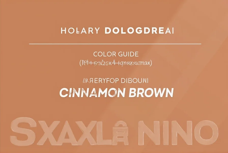
Cinnamon brown occupies a special place in color theory as a versatile earth tone that bridges warm reds and deep browns. This distinctive shade gets its name from the familiar kitchen spice, capturing the rich, aromatic essence of cinnamon in visual form. Unlike cooler browns that lean toward gray or black, cinnamon brown maintains a vibrant warmth that makes it particularly appealing for both interior design and personal aesthetics.
Understanding Cinnamon Brown Color Specifications
For designers and color enthusiasts, precise color specifications matter. Cinnamon brown's technical representation includes:
| Color System | Value |
|---|---|
| Hex Code | #7B3F00 |
| RGB Values | (123, 63, 0) |
| CMYK Values | (0%, 49%, 100%, 52%) |
| HSL Values | (26°, 100%, 24%) |
This specific combination creates a color that's darker than traditional cinnamon but retains that characteristic warmth. The red-orange undertone distinguishes it from more neutral browns, making it an excellent choice when seeking depth without sacrificing vibrancy.
Cinnamon Brown in Color Theory Context
Within the color wheel, cinnamon brown sits comfortably in the warm spectrum, specifically in the reddish-brown quadrant. It's created by mixing red and brown pigments with a higher proportion of red, resulting in that signature warmth. This places it adjacent to colors like burnt sienna and terra cotta, though with greater depth and less orange influence.
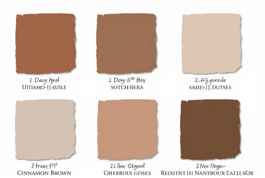
When comparing cinnamon brown to similar earth tones, several distinctions emerge. Unlike chocolate brown which leans toward pure brown with minimal undertones, cinnamon brown maintains noticeable red warmth. Compared to chestnut brown, cinnamon brown appears slightly darker and more saturated. Mahogany shares similar warmth but typically contains more purple undertones, while cinnamon brown remains firmly in the red-orange spectrum.
Practical Applications of Cinnamon Brown
Interior designers frequently select cinnamon brown for spaces requiring warmth and sophistication without overwhelming darkness. In living rooms, it works beautifully as an accent wall color paired with cream or beige furnishings. The shade creates an inviting atmosphere in dining areas, particularly when combined with gold or brass accents that enhance its warm undertones.
For home staging, cinnamon brown serves as an excellent neutral that appeals to broad demographics. Unlike cooler grays that dominated previous design eras, cinnamon brown offers a more welcoming alternative that works across various architectural styles from traditional to contemporary.
Cinnamon Brown in Fashion and Beauty
The popularity of cinnamon brown hair color has surged in recent years as a natural-looking alternative to traditional brown shades. This particular hair color works exceptionally well for individuals with warm skin undertones, creating a harmonious effect that enhances facial features. Professional colorists often describe cinnamon brown hair as providing "dimension without dramatic contrast"—lighter than espresso but with more warmth than ash brown.
In fashion, cinnamon brown serves as a versatile neutral that bridges the gap between black and brown. Designers incorporate this shade in autumn and winter collections for leather goods, footwear, and outerwear. When selecting cinnamon brown clothing items, consider pairing them with complementary colors like olive green, mustard yellow, or deep teal for maximum visual impact.
Effective Color Combinations with Cinnamon Brown
Creating balanced color schemes with cinnamon brown requires understanding its warm nature. The most successful combinations include:
- Cream or ivory - provides soft contrast that highlights cinnamon brown's warmth
- Olive green - creates an earthy, natural pairing that works well in both interiors and fashion
- Mustard yellow - enhances the warm undertones for a vibrant autumnal palette
- Deep teal - offers striking contrast while maintaining sophisticated harmony
- Gold or brass metallics - amplifies the richness of cinnamon brown
Avoid pairing cinnamon brown with cool pastels or icy blues, as these combinations create visual tension rather than harmony. For monochromatic schemes, layer different shades of brown from light beige to dark espresso, using cinnamon brown as the mid-tone anchor.
Cinnamon Brown Across Different Mediums
When working with cinnamon brown across various mediums, slight variations occur due to material properties and lighting conditions. In paint, cinnamon brown appears differently under natural versus artificial light—showing more red undertones in daylight and appearing deeper in incandescent lighting.
For digital design, ensure proper color calibration when using cinnamon brown hex code #7B3F00, as monitor settings can significantly affect how the warm undertones appear. In print design, specify Pantone 7515 C as the closest standard match to achieve consistency across materials.
Common Questions About Cinnamon Brown
What's the difference between cinnamon brown and chestnut brown?
Cinnamon brown features more pronounced red undertones and appears slightly darker than chestnut brown. Chestnut brown typically has a richer, more reddish hue with higher saturation, while cinnamon brown maintains a deeper, more subdued warmth. In practical terms, cinnamon brown works better for creating sophisticated, grounded spaces, while chestnut brown often appears more vibrant and energetic.
Does cinnamon brown hair suit fair skin tones?
Yes, cinnamon brown hair can beautifully complement fair skin tones, particularly those with warm or neutral undertones. The reddish warmth in cinnamon brown helps prevent the "washed out" effect that sometimes occurs with cooler brown shades. For fair complexions with cool undertones, a professional colorist might recommend a slightly less intense version of cinnamon brown to maintain harmony. The key is ensuring the cinnamon brown contains enough red warmth to complement rather than compete with fair skin.
Which paint brands offer authentic cinnamon brown colors?
Several major paint manufacturers offer cinnamon brown variations, including Sherwin-Williams' "Cinnamon Stick" (SW 7535), Benjamin Moore's "Cinnamon Slate" (2108-30), and Behr's "Spiced Cider" (PPU4-19). These colors capture the essential warmth of cinnamon brown while adjusting saturation and depth to suit different lighting conditions and design applications. When selecting paint, always test large swatches in your actual space, as lighting dramatically affects how the red undertones appear.
How does cinnamon brown perform in small spaces?
Cinnamon brown can work effectively in small spaces when used strategically. Its warmth creates an intimate, enveloping feeling rather than making the space feel closed in. For optimal results in smaller rooms, use cinnamon brown on a single accent wall rather than all walls, and pair it with lighter complementary colors on other surfaces. Incorporate ample lighting—both natural and artificial—to prevent the space from feeling too dark, as cinnamon brown's depth can absorb light in poorly illuminated areas.
What's the best way to maintain cinnamon brown hair color?
To preserve cinnamon brown hair color, use sulfate-free, color-protecting shampoo and conditioner formulated for brown tones. Incorporate a color-depositing mask once a week to refresh the red undertones that tend to fade faster than the base brown. Avoid excessive heat styling and always apply heat protectant when styling. Most importantly, schedule touch-up appointments every 6-8 weeks to maintain even color, as the distinctive warmth of cinnamon brown can develop brassy tones if left too long between treatments.


 浙公网安备
33010002000092号
浙公网安备
33010002000092号 浙B2-20120091-4